Monday, September 26, 2011

Photo love....

I've started a new online class -- Kat Sloma's "Find Your Eye: Starting the Journey."  I hope to discover what inspires me as a photographer, and how to begin the process of translating my inspirations into actual images.  As I've been mulling over what it is that I love about photography, I'm struck by how perfectly this aligns with the theme over at Kim Klassen's cafe this week.  Be sure to visit her site and check out all the "Love"-ly textured goodness there!

I think my primary motivation is to capture images that are portals. I want that Proustian moment, where the image instantly transports me to a particular time and place -- either real or imagined. I think that's why I love textures so much. They give an ordinary photo a "false history," which captures the viewer's imagination and adds a sense of story.

Processed with Kim Klassen's "Mayzee" (color burn @28%) and "Scripted Autumn" (color burn @100% and screen @57%, texture brushed off center)
 This could be "once upon a time...."
Kim Klassen's "Warm Grunge" (soft light @100%)
Sometimes all I have to do is just look at a photo, and I'm reliving that moment in time. Here, I remember every nuance of the lunch-time conversation with my husband, the feel of the spring breeze on my face as we ate outdoors, the joy at being back in Italy, where we spent the first four years of our marriage....
Kim Klassen's "luminous" (linear burn @35%), and three layers of "warm sun" (screen @100%, soft light @100% x2, texture brushed off plate)
....not to mention the fact that food just plain tastes better in Italy!

I also take pictures to recapture a sense of place.  This is more interesting to do when traveling, but I try to think like a tourist at home, too. Not too successfully I might add... these are all from Italy:


My eye is always seeing interesting things, but more often than not I'm too hesitant to move in to get a better shot.  This shot of the men having lunch could have been good, but how do you move a parked car?  I used my telephoto lens here -- the very thought of intruding on their meal made me nervous!  I'm hoping to get better at this.  I love street scenes!

I take pictures to get inspiration for my art.  I am drawn to the graphic designs and patterns I see in nature:


I also take pictures so I can laugh. I ran across this guy on a hike through England's Lake District last summer:
Kim Klassen's "Love in Layers" (color burn @100% and screen @83% with texture brushed off sheep to create a vignette)

And of course, there's Jackson...the only dog I know who sits on the seat in the car and gets indignant when a human tries to share his space.


I guess the idea is that if you know what inspires you to take pictures, you've taken the first step toward actually taking the pictures you want.
Monday, September 19, 2011

Balance

I am pulled between two very different color stories.  I am energized and excited by the intense, saturated colors like the ones I dyed last week.  But the historian in me is also drawn to the grungy, vintage browns, rusts, and sepia colors that evoke a weathered past.  So to balance all the color from my last post, I decided to go vintage this week for my Texture Tuesday submissions.  Kim left the theme up to us, as long as we use at least one layer of her textures.  That part was easy, since she freely offers so many of her gorgeous textures.... but sometimes I find it hard to come up with interesting images to use in the first place.  I am looking forward to taking some online photography classes, as well as going on some "real-life" photo walks this fall, so hopefully I'll start to get some inspiration.  In the meantime, check out Kim's cafe for some wonderfully inventive uses of texture.

This photo was taken at 6 am on Friday.  My dog, Jackson, is an early riser, and I have learned to keep my camera handy just in case.....
Processed with Kim Klassen's "Thursday" (soft light @100%, color burn @16%, and linear burn @35%) and her "Scripted Autumn" (soft light @60%, texture brushed off of sky)

I see so many people setting up their own still lifes, so I gave it a try:
Kim Klassen's "Luminous" (soft light @100% and overlay @33%) and her "Pourvous" (overlay @53%, texture brushed off books and jug.)

This is an antique mixing bowl, which I set on the table runner I made from my erosion bundle fabrics:
I can't find where I wrote my recipe for this one, oops!
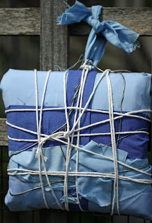
Speaking of erosion bundles... I started a new one on September 15th:
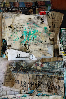
This one has a lot of rusty stuff bundled up in there, along with several photographs.  It's mostly fabric this time; fewer papers.  I decided I like the weathered look that you get from rubbing citrasolv on National Geographic pages better than the aged papers I got from the erosion bundle (with a lot less effort ) -- so this time I focused more on seeing what a year of weathering will do to fabrics.  Check out this space again in a year for the results!!

Gratuitous Jackson pic:
Hipstamatic shot taken on my iphone, processed with two layers of Kim's "Warm Sun" (overlay @50% and color burn @17%)


I'll close with a page from my art journal:
I was thinking I couldn't link up with Julie Fei-Fan Balzer's Art Journal Every Day this month because I am not always able to work directly in my journal...

But then I thought about it some more, and decided that yes I can!  Taking photographs counts as journal time, because I might use the images as collage fodder.  Working on the erosion bundle counts, because I'll use the eroded materials in my journal in some fashion or other.  Dyeing tissue paper counts, because one day I'll use pieces in a journal page.  I've decided that as long as I'm following my artistic impulses -- no matter how circuitous they may seem to an observer -- one of these days I'll get to wherever it is I'm going.

Tuesday, September 13, 2011

Doing some dyeing!

My kitchen has been turned into an art studio this week: my daughter has claimed the breakfast table for her paintings, and I have taken over the counter, sink, and work table for fabric dyeing.

I cleaned everything up this afternoon, just in time to take a few photos before it got dark, so I can link up to Texture Tuesday over at Kim Klassen's cafe.  The theme this week is "Do...."  Well, I've been doing lots this week... but not photography! Click here to check out the gorgeous images submitted by thoughtful artists who take their craft seriously -- my photos were taken almost as an afterthought; still, I think you can see I am in a colorful mood!

Kim Klassen's "Scripted Autumn" (overlay @100%), my "medium copper" (lighter color  @70%),

"Scripted Autumn" (soft light @100%), my "medium copper," (inverted, soft light @100%)

"Scripted Autumn" (overlay @100%), my "light copper" (inverted, soft light @50%)
Sometimes I just want to make colors, and that's why I love to dye -- I really enjoy the mad scientist aspect of mixing the dyes and playing with chemicals.  But most of all, I am thrilled by the mystery of how it will all turn out.  I like to do low-immersion dyeing; the patterning of the colors on the fabric (and even the colors themselves) comes out differently every time since I don't follow exact recipes.

(I generally leave the fabrics in the dye anywhere from 4 to 24 hours.  I am not overly fussy about the batching time.)

This time I also dyed yarns, threads, cheesecloth, throwsters waste, and silk carrier rods.  They all took the dye beautifully!


I like to use the spent dye to stain tissue paper or paper towels for use in collage.  The dye that has already been used to dye fibers still has enough umph to color the papers and since I hate to let anything go to waste, I embarked on a major paper staining sub-project.  You can see in this photo how you quickly run through stacks and stacks of tissue paper; for some reason I ended up with miles of green paper.....

One thing leads to another, and since I had all the equipment out, I wanted to try batiking using dyes instead of paint.  (I had previously taken a workshop on soy wax batik with Melanie Testa using fabric paint.)  The soy wax stood up pretty well to all the rinsing you have to do to get rid of excess dye.  The beauty of soy is that it is safe for household plumbing -- a good thing since much of it washed out in warm water.  The photo doesn't do justice to these pieces.... they turned out very well:


As if all this wasn't enough, I've been reading Jane Davies' new book, and thought I'd try out the tyvek technique she mentions in it.  You basically just iron some tyvek between sheets of newspaper (you can use an express mail envelope from the post office).  After a few passes with the iron, it will begin to shrivel and distort.  Being careful not to melt it too much, you can get some interesting weathered effects.  Here, I've taken shriveled tyvek pieces and painted them with metallic paints.


British artists such as Maggie Grey and Jean Littlejohn and Jan Beaney use these in their free-form embroideries, but I think they would also work well in collage. Here, I've used a piece as a decoration for a box I made:
Sometimes I think that I enjoy making the elements of art -- the decorated papers, the painted and decorated surfaces, the dyed fabrics -- even more than the finished artwork.  I love color and texture for its own sake.  What's your favorite part of the process?

Tuesday, September 6, 2011

Candy coated popcorn, peanuts and a prize...

You know, sometimes you just look at a texture and you know immediately that it's going to work for you.  Kim Klassen's texture for this week is called "Cracker Jack," and I am in love.  It's just the right thing to use to give your image a vintage feel.

My garden is looking dreary and bedraggled from the big storm last week, so I dipped into the archives to play with my new favorite texture.  Click here to visit Kim over at the Cafe, and check out all the wonderful eye candy there.

First I tried it on some daisies:
Kim Klassen's "Cracker Jack" (color burn @100%), "Mayzee" (soft light @51%) plus one layer of  a texture of my own (made from macro photos of the copper pans I showed for the Orange e-dition of TT!) 


"Cracker Jack" (overlay @70%) and "Cracker Jack" (color burn @75%) plus one inverted layer of my copper texture

I didn't record my texture recipe... sorry!  I think I used Kim's "Aurora" and not "Cracker Jack," in any case....

 It added a nice rough texture to this grasshopper -- doesn't he look like an alien?
I added a gradient map adjustment layer (blue-purple-green), then "Cracker Jack" (linear burn @100%), and another layer of "Cracker Jack" (inverted, then put  on screen mode @51%)

I used it on some Italian architecture, and here's where I started to really see some possibilities:
"Cracker Jack" (soft light @25%), "Cracker Jack" (overlay @39%),  "Warm Grunge" (soft light @75%), "Warm Grunge" (screen @20%), and one layer of my copper texture

"Cracker Jack" (overlay @57%), "Mayzee" (multiply @22%), "Warm Grunge" (overlay @49%), and one layer of my copper texture

"Cracker Jack" (soft light @10%), "Warm Grunge" (overlay @100%), "Mayzee" (color burn @25%), and one layer of my copper texture

"Cracker Jack" (overlay @48%), "Warm Grunge" (color burn @61%), "Mayzee" (overlay @40%), and one layer of my copper texture
But this last one is my favorite of all -- it made this hill town look like an old map:
First, I cut the town from the background and applied the poster edges filter.  Next I added "Cracker Jack" (overlay @100%) and "Mayzee" (normal blending mode @66%, texture brushed off the buildings.)
When I wrote the title for this post, I was thinking of the old Cracker Jack commercial -- the one with the little kids at the fair.... (I would sing the jingle for you, but you might never come back! Check it out on YouTube instead.)  I don't really have a prize, but I thought I would share my copper textures if you are interested.  I merged several images of copper pans on three different blending modes, and really like the results.  They give a nice warmth to an image, and if you invert them, you get a lovely blue color mask. If you do use them, please link back and show me what you've done with them!! Click here to access my mediafire box.
"light copper"

"medium copper"

"verdigris"

Sunday, September 4, 2011

My erosion bundle ...revealed

On August 5, 2010, I bundled together fabrics, photos, tea leaves and various papers, and placed it on my fence to weather for a year.

I wrote about the Erosion Bundle project a few months ago (here); I meant to open my bundle exactly one year later, but life (and Irene) intervened.  So, better late than never, here is what I found:

The bundle itself was in pretty good shape.


The fabrics definitely faded where they were in the light, but showed little wear in the areas that were encased in the bundle.


I decided to make a table runner with my weathered fabric.  I wanted to make something that looked like it had been used for years.  My husband, very tactfully, asked me if I had experienced some problems making it.

...He doesn't get "wonky:"

I didn't photograph the back, but I used the pojagi method of piecing, which encloses the seams so front and back are interchangeable. Victoria, over at The Silly BooDilly, has a very clearly-written tutorial (and if you search for "pojagi" on her blog, you will find some gorgeous examples.  Pojagi is a Korean form of patchwork that can be interpreted in so many ways -- see videos of Korean artist Chunghie Lee
here, or here).

My erosion bundle also revealed some gorgeous papers.  The photos I included discharged their ink in interesting ways.  I can't wait to use them as backgrounds in collage:


Some of the papers look like they are covered in black mold.  I had painted them with black tempera paint -- it's not mold, so no health worries here!!  Actually, I wish I had used a more permanent acrylic paint, since the tempera brushed off the surface after everything dried out, leaving a more subtle charcoal effect than the black streaks you see here.


I put some tea leaves in the bundle, too.  They really didn't have much of an effect at all -- in fact, you really can't see them:


I think this was a pretty successful effort overall.  I am going to do this again, but this time I will include rusty items among the fabrics.  I will add some threads and laces, too, and lots more photographs.  I really like the way the inks ran.... I wonder how they would run on fabric? Hmmm... lots to think about here.  Any suggestions?